The recent Oscar win for Guillermo del Toro’s Pinocchio isn’t quite garnering the attention it deserves. The film's Oscar conquest has added fuel to a quiet but growing rebellion amongst the world’s top animation studios. But to know the rebellion we must rewind.
Our story begins with an oft-told tale: Pixar and its epoch-defining 1995 debut, Toy Story. At a time when most computer-generated 3D animated content resembled plastic figurines in motion, it was a stroke of genius to make a film about toys. With toys as characters, Pixar allowed itself the space to experiment with an eclectic mix of facial styles, even as it perfected its realistic backdrops.
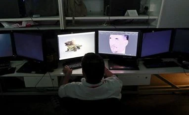
This was the founding stone in Pixar’s animation bulwark, aka the Pixar look — cartoonish features set against backgrounds that look only slightly embellished from an actual photograph. With newer, more powerful rendering engines, Pixar would further heighten the realism of its canvas. Check out the cityscapes of New York and Paris in films like Soul and Ratatouille, or the minute specks of dirt in Wall-E and the fibers on Mr Incredible’s shirt. The Pixar look is also rooted in a specific rendering process called physical rendering, which tries to replicate the real-world physics of light, shadow, reflection, focusing tendencies of the human eye, and more. Thus, backgrounds are blurred out, bokehs emerge, shadows are blended and outlines softened.
This animation style, a photo-surrealism if you may, has not only become the signature style for Pixar but has been vociferously adopted by other studios. It's the style that sells. So much so that if you were to pick up Wish Dragon or Luck or Wonder Park, it would be hard to know from their animation alone that they are not Pixar properties but belong to Sony Pictures Animation, Apple TV+, and Paramount, respectively. Animated shorts have been more experimental with their choice of animation styles. But when it comes to feature-length productions, which call for massive financial and time investments, even films that began with more stylised concept art, ultimately fall back to physical rendering.
Pinocchio is a different beast, however. Using stop-motion animation, the musical dark fantasy adds both depth and weight — sometimes literally — to animated puppetry, using 3D-printed metal and wooden figurines, clothing, and sets. Stronger, bolder lines replace the muted outlines of Pixar, shadows become darker, lighting more dramatic, and character designs are more stylised, eccentric even. A more famous example, and the movie that emboldened feature-length filmmakers to experiment, is the 2018 Oscar winner Spider-Man: Into the Spider-Verse. It bypasses photo-realistic rendering altogether. Instead of receiving a realistic-looking render based on the data from lights, cameras, and real-world textures, they run these through custom data passes that add stylised tweaks to aspect ratios, focus planes, the way light works, or how colour is rendered.
For instance, instead of blurring the out-of-focus background — as is the case in traditional rendering mimetic of cinematic focus — the Spider-Verse films split the colours into CMYK as if this was a poorly printed comic book page. In older comic books, printers often found it difficult to keep all constituent colours within the stencil outlines for the tiny background elements. Thus, the colours appear to bleed.
Then, the images were layered with comic-book dots, and shading hatch marks. Freezeframes revealed simplified line-drawn bursts that mimicked comic book panels. Motion blur and depth-of-field were either reduced or eliminated altogether. Motion lines and sound words like “thwip” or “boom” were added. The whole canvas was transformed to imitate a comic book.
Films like Puss in Boots and The Mitchells vs The Machines use watercolour- and oil-painting-inspired brush blots for simplified backgrounds, and brushstrokes to depict textures, shades, and shadows. And it’s a two-way street. Klaus incorporated 3D-style lighting for their 2D animated film.
But what does this all mean? Well, drawing is like handwriting. And just as every individual has a different handwriting, so varies the drawing style from artist to artist. Studios and publications often ask their artists to keep close to the company style, or an identical handwriting. In the business of animation, this orthodoxy of form is particularly limiting to markets like India, China, and Japan, which are rapidly claiming the lion’s share in animation studios and talent. These global studios have their own unique animation styles. The Indian studios have a knack for using the ligne claire drawing style as an animation base. European studios love stop-motion genres like papier-mâché, claymation, etc. China and Japan have 3D versions of Donghua and Anime, respectively.
The dominant Pixar look forces these studios to either render and design according to the market conventions or lose out on big Hollywood projects. Emboldened by the success of Pinocchio or Spider-Verse, one hopes directors will now be more willing to let these studios draw on their own strengths.
Unlock 30+ premium stories daily hand-picked by our editors, across devices on browser and app.
Pick your 5 favourite companies, get a daily email with all news updates on them.
Full access to our intuitive epaper - clip, save, share articles from any device; newspaper archives from 2006.
Preferential invites to Business Standard events.
Curated newsletters on markets, personal finance, policy & politics, start-ups, technology, and more.
)